Tableau is one data visualization tool we love to use here at Evolve. With Tableau, your creativity almost has no limits! It can be a great way to show data over time, highlight the correlation...
Have you ever asked yourself, “What were the most popular types of charts used last year?” Well, you’re in luck because the team over at Datawrapper put together these charts covering the top chart...
It’s that special time of the year when the comforting scent of roasted turkey and pumpkin pie fills the air, and families come together to celebrate and be grateful. So many holiday traditions and...
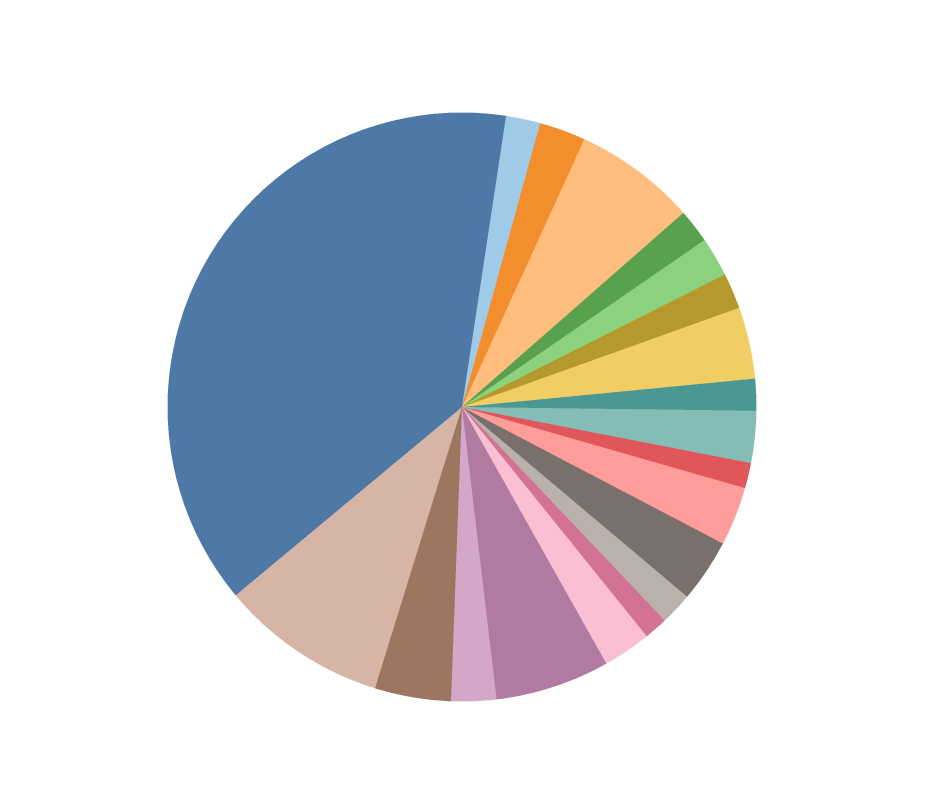
For me, pie charts evoke memories of college - working with fellow students to create them in Excel or Word, and incorporating them into our strategic marketing assignments. I'm sure that for many...
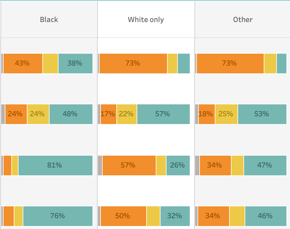
We've published data about Advancing Oklahoma's landmark study on race in Oklahoma.
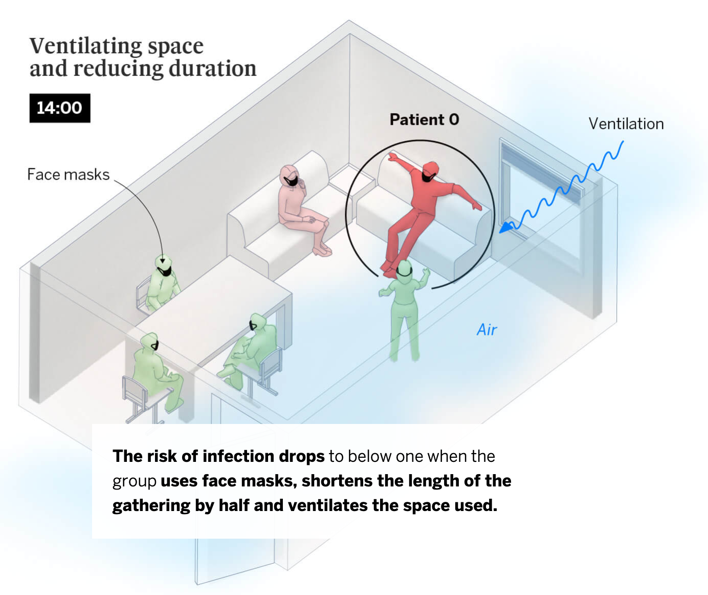
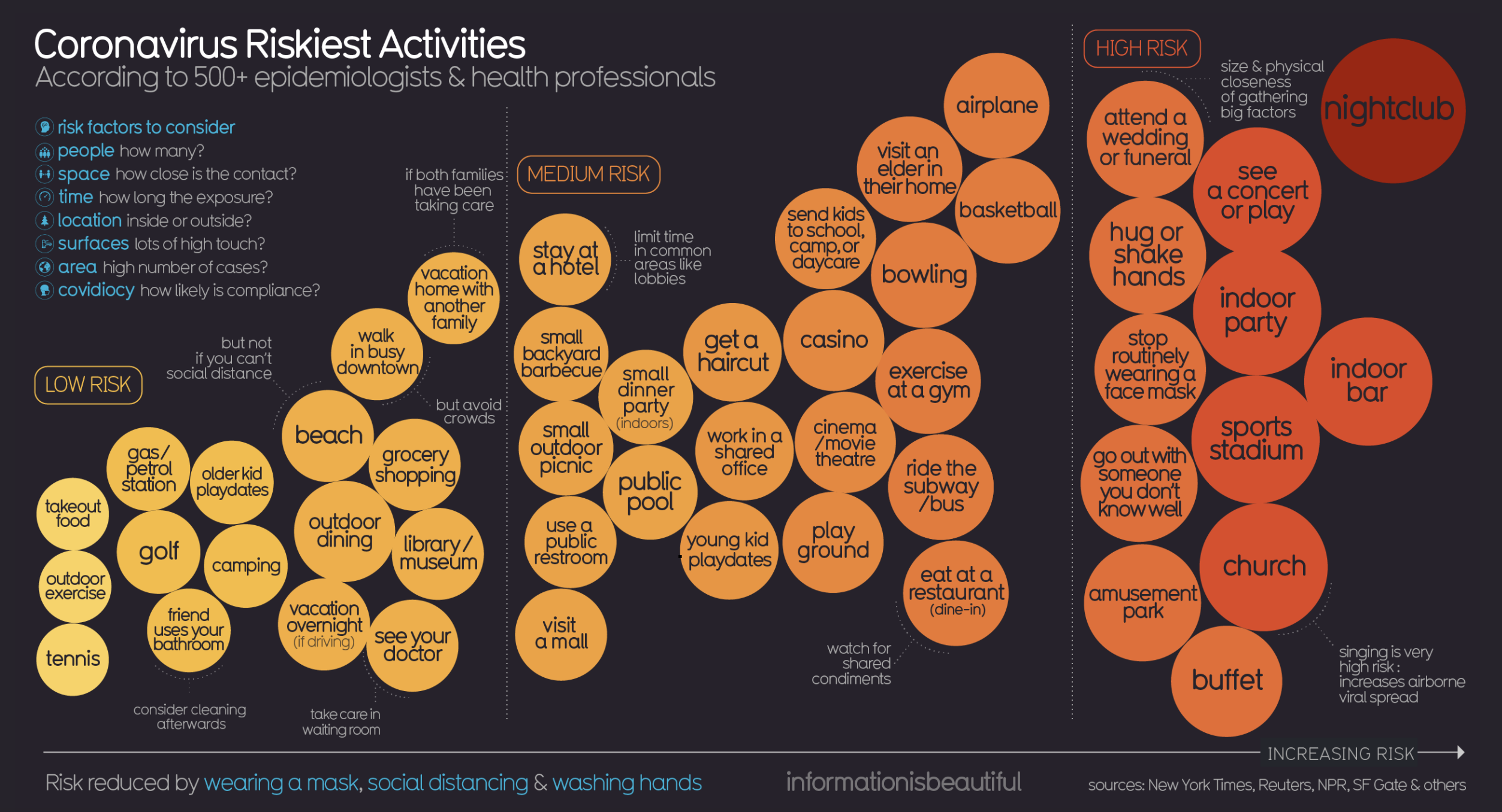
The infectious nature of COVID-19 is undeniable - if we don't take measures to protect ourselves, then we will succumb to the virus. We all know the safety measures. Mask-wearing and social...
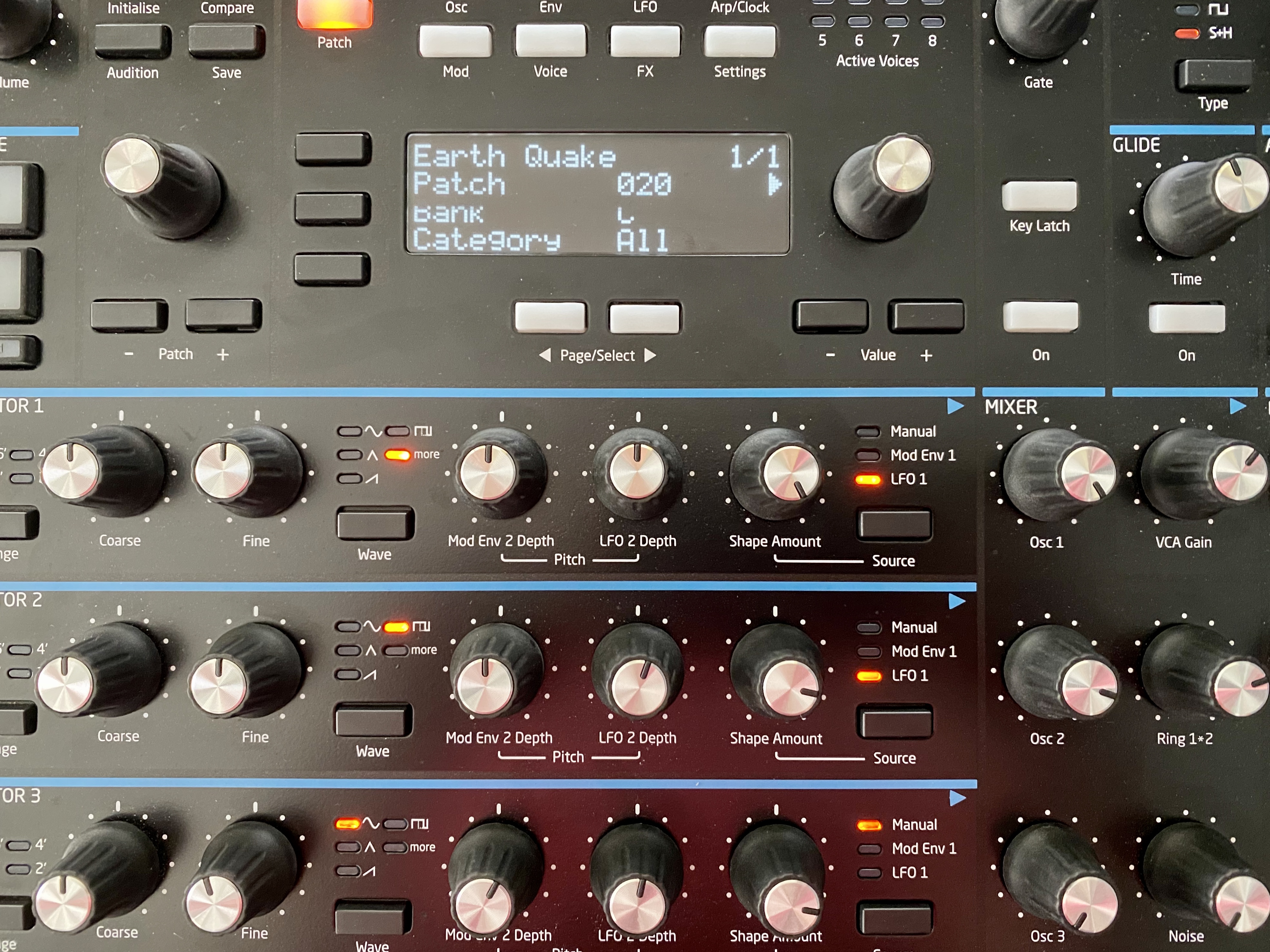
Data sonification - the audio equivalent of data visualization - can be done in a variety of ways. In this post, I'll explore how we sonified a month's worth of global earthquake data.
We’ve been dealing with the coronavirus pandemic for almost 7 months at this point. Just about every aspect of our lives has had to change to accommodate the safety measures that are recommended...
Recently we visualized a month's worth of global earthquake data in a short minute-and-a-half spatial animation. I was happy with the result, but I felt it was missing something. The visualization...
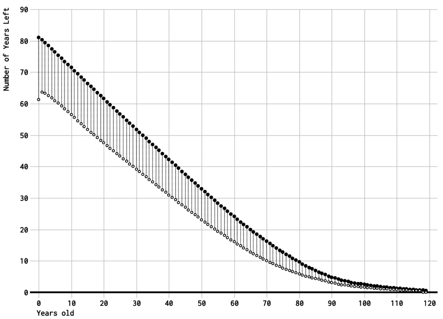
Defining old age can be tricky. Is it related to how you look or feel? Or, is old age defined by a specific number of years? Well, I stumbled on an article that attempts to answer that difficult...


