

For me, pie charts evoke memories of college - working with fellow students to create them in Excel or Word, and incorporating them into our strategic marketing assignments. I'm sure that for many of you, the humble pie chart was one of the first charts you ever constructed.
However, pie charts are rather divisive. While they are a staple in data visualization, they also have a reputation for being, well, subpar (i.e. crappy). Although I don't think they're as atrocious as the folks over at Insider claim, I do believe their application is quite restricted.
When to Use a Pie Chart
Let's start with the positives. Pie charts are useful for analyzing a limited amount of data - two or three categories at the very most. To maximize the effectiveness of pie charts, remember to:
- Choose logical colors (this can be subjective)
- Always label your segments.
- Don't chart more than three categories of data.
A great instance of when to use a pie chart is with binary data, such as yes/no questions. For example, "Do you like pie charts?"
When Not to Use a Pie Chart
In most instances, you would want to avoid using a pie chart. Do not use a pie chart if:
- You have more than three categories of data
- You are comparing data, i.e. you want to look at more than one chart
- You're depicting results over time
- You need precise reads on data
Examples
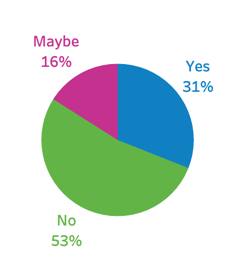
This is a model usage of a pie chart. The data is minimal, and the proportion of responses is clearly visible. It's labeled – the chart leaves no room for second-guessing.
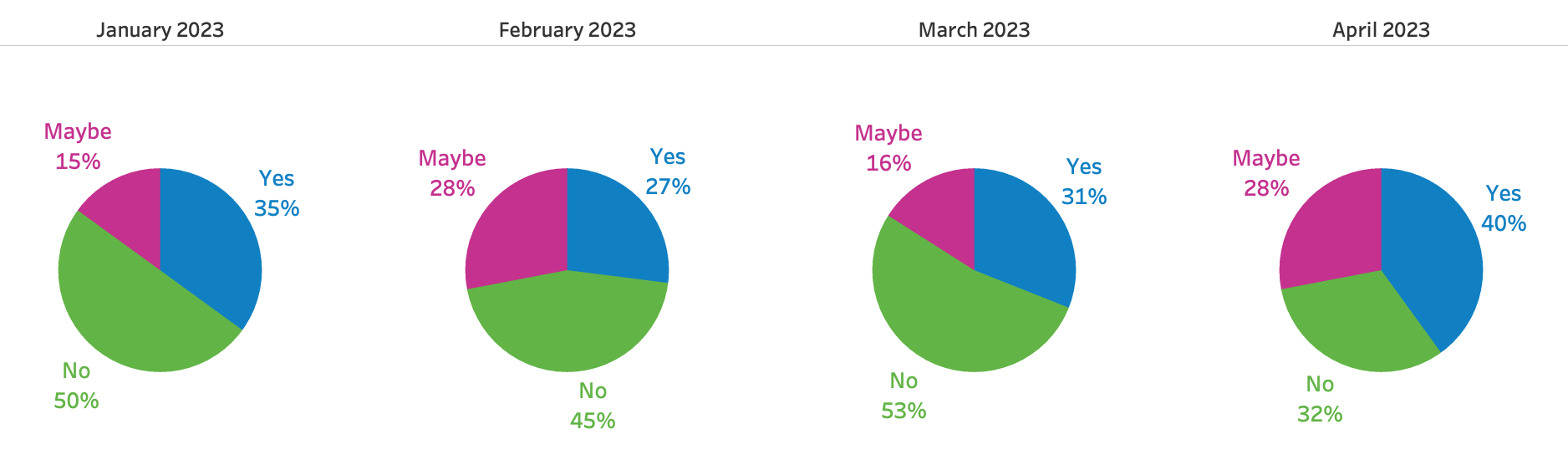
The next example is similar to the first - we're still charting minimal data, but we've added a historic component to the visualization. Pie charts are horrible for making comparisons over time - it's really hard to view the differences in the data. Line charts or bar charts are the best for this type of data.
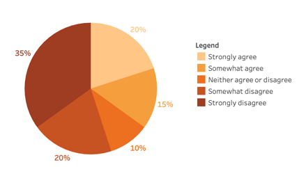
The next example is a bit complicated. It involves ordered data (ranging from strongly agree to strongly disagree), and pie charts are not very suitable for discerning items in a sequential order. Despite having only five categories, it's already looking a bit crowded. We have to cross-reference the color of the pie slice with the legend, which distracts us from the data and makes us think. A segmented bar chart would be a much better choice here.
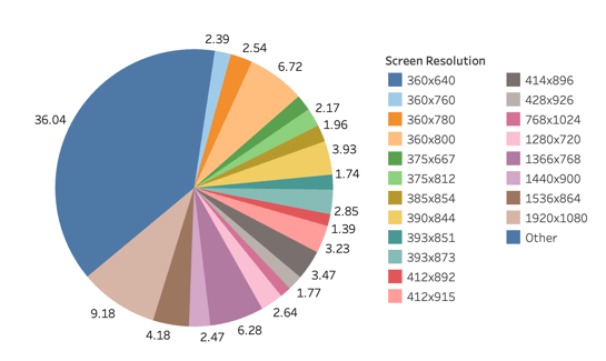
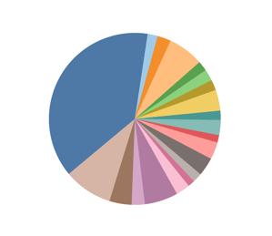
The final example is rather atrocious – and unfortunately, you'll find this type of pie chart used quite frequently. It's chaotic and dissonant. This visualization serves no purpose whatsoever. A table of data would be far more effective!
Pie charts do have a place in the world of data visualization, but their usage is incredibly limited. In most cases, you'll probably want to avoid this classic chart and opt for a different visualization.
EvolveKev

Kevin is all about research. Qualitative, quantitative, UX, you name it. When he's not researching, he's to be found laying down beats in his studio and hanging out with his dogs (and girlfriend). Woof.