
Data sonification - the audio equivalent of data visualization - can be done in a variety of ways. In this post, I'll explore how we sonified a month's worth of global earthquake data.
This particular sonification project did not use any AI tools or sonification programs. We wanted to customize the experience entirely, allowing us 100% control of the sonification.
We used three specific tools for this project:
- Tableau - used to visualize and deconstruct the data. It was also used to help map the data to sound.
- Excel - used similarly to musical notation, the spreadsheet was used to translate the data map into a musical time signature.
- Ableton Live - a dedicated piece of software used to compose and orchestrate music. The software also controls musical equipment like synthesizers.
The sonification principle was simple - we wanted to use sound to support our visualization of global earthquake data.
Step 1: Mapping the Data Using Tableau
Since we built the original visualization in Tableau, all of the data we needed for this project was contained within the program. Our visualization used the following parameters:
- Date and time of the earthquakes
- Location of the earthquakes
- The magnitude of each earthquake
- The number of earthquakes at any given time/date
Tableau helped us get a clear overview of the data and decide how we wanted to use it. Our decision here would dictate the direction of our sonification. We chose the map the data like this:
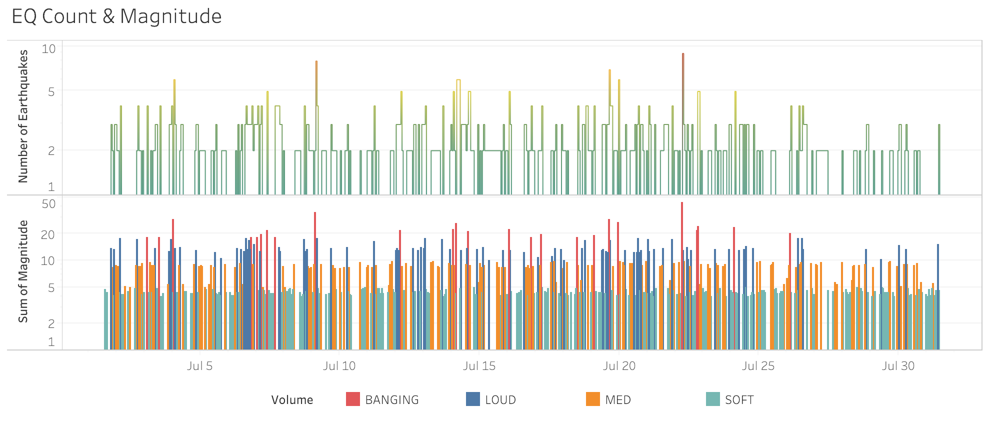
Using Tableau to figure out the intensity of the sonification
The date and time of the earthquakes were a constant and predictable variable. Therefore, this information was an excellent candidate for the tempo of the sonification. Each date represented a beat.
The number of earthquakes in a day indicated how many instruments would play at the same time.
The combined magnitude of all the earthquakes in a day determined the volume of the sonification.
We did not use the location information in the sonification process - the data visualization exclusively used this data point.
Step 2: Using Excel as a Music Sheet
After analyzing and exporting the data from Tableau, we transferred the process over to Excel. Excel was used to paint an overall picture of the sonification by displaying every beat (time and date information). It also showed the number of instruments playing at once (number of earthquakes at any given time point) and the sonification volume (dictated by the earthquakes' combined magnitude).
The screenshot below shows how this information looked. The spreadsheet contained 122 (check) columns.
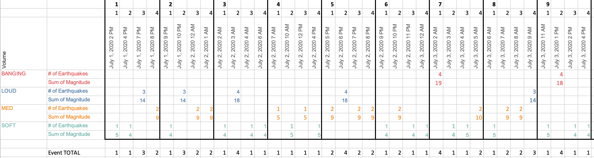
Breaking the track down - Excel tells us what to play and when
It is worth mentioning steps 1 and 2 took a considerable amount of time to author. Just like data visualization, sonification involves a lot of thought and data massaging to get things "just so."
Step 3: Composing the Sonification
This is the part where we get creative with data. With a visualization, we get to pick the most appropriate charts and colors. With a sonification, we get to choose the tone and the sound palette.
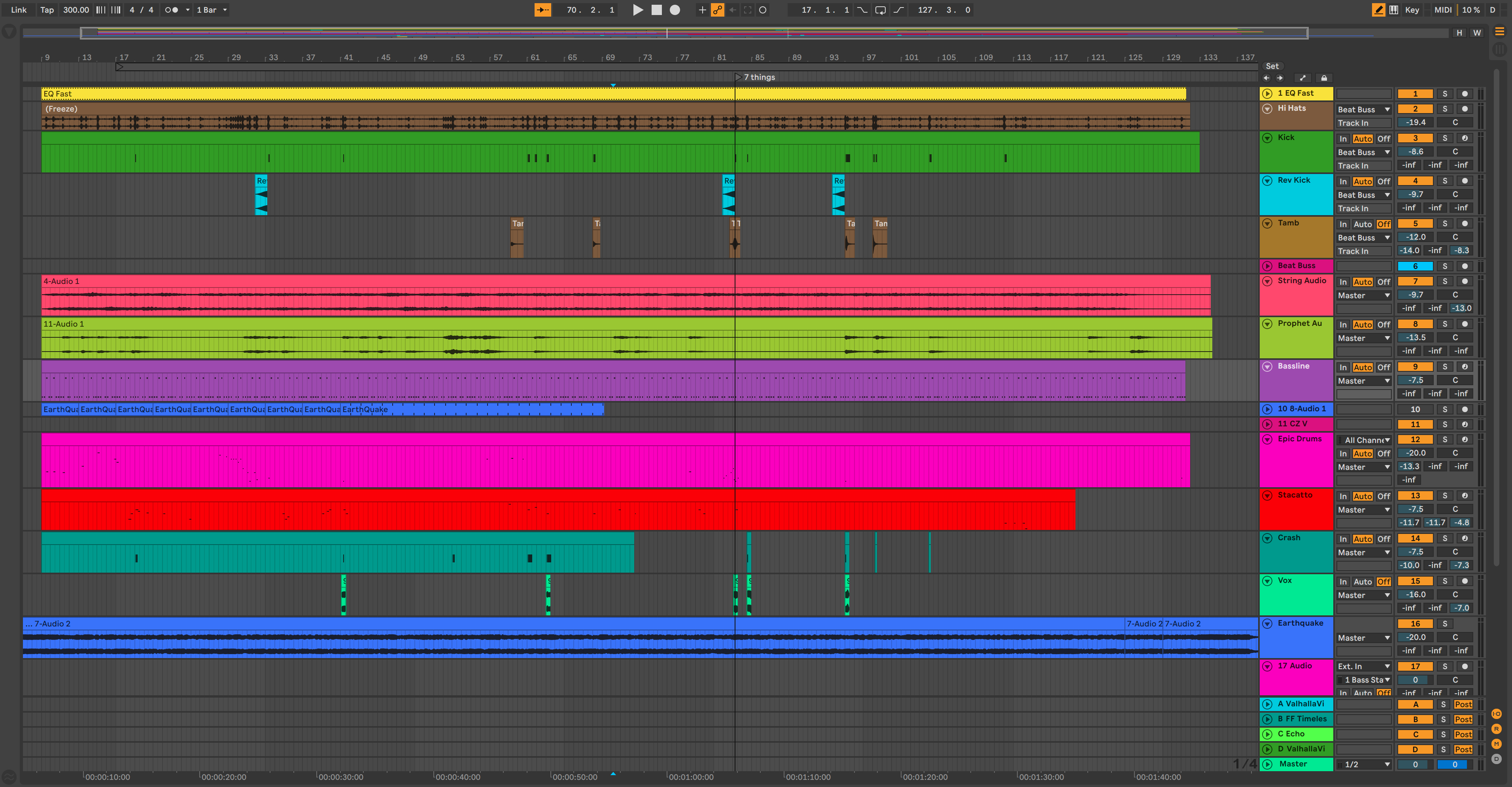
The final composition in Ableton Live
We decided on a dramatic flavor for the tone - we're talking about earthquakes, after all! A John Carpenter-esque vibe created dramatic tension with the dataset.
A combination of vintage-sounding synthesizers and classical orchestration transformed the overall sound into something akin to a movie score.
Once the creative concept was agreed, we proceeded to turn the data from Excel into music.
We used a simple bassline to represent our time criteria. Each note of the bassline described an hour that an earthquake (or 'quakes) occurred. Every time you hear a bass note, time is passing. This part of the sonification also sets the tempo for the music.
The volume of the hi-hats described the magnitude of all the earthquakes happening at that given hour.
The number of instruments playing at once directly correlates to the number of earthquakes happening.
The vocal snippets only occur when six or more eruptions happen at once.
Here's a nerdy bonus - the ominous synthesizer sound you hear in the intro and outro (it plays throughout the sonification, too) is the sound of an actual earthquake that has been digitized and synthesized.
The composition process was, by far, the most time-consuming. Since the data dictated what was played and when, it was quite challenging to be creative while working within those parameters. The composition phase took several evenings, while the data preparation took a few hours.
It's worth noting that syncing the video and sonification was a bit of a head-scratcher at first. Since the viz was done a few months before the sound, we had to use the map animation to set a fixed tempo. Each frame of the animation translates to a musical measure. Since the music software and video software don't talk, I had to take what I've learned from my wife of over 17 years and "just freaking eyeball it." As reluctant as I (always) am to admit it, eyeballing worked perfectly!
Let us know your thoughts - or if you have any ideas for sonification projects. We'd love to hear from you!
EvolveKev

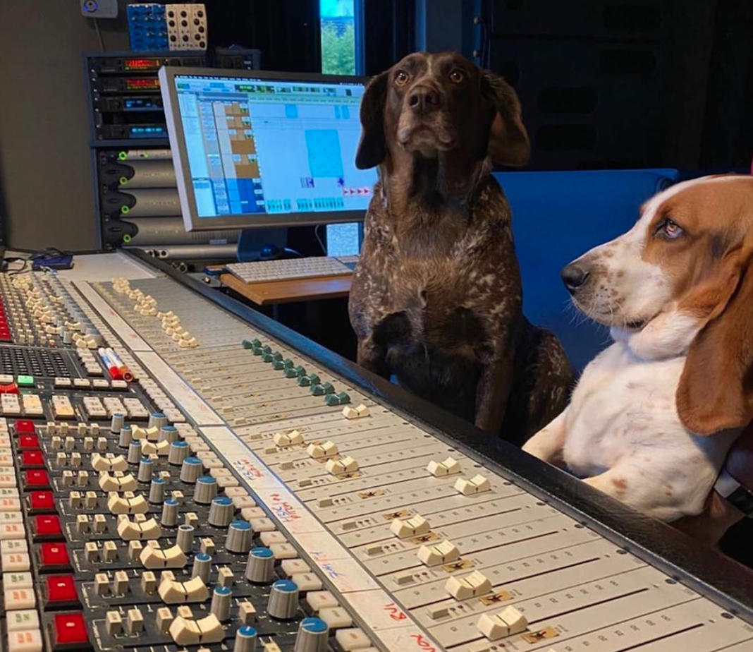
Kevin is all about research. Qualitative, quantitative, UX, you name it. When he's not researching, he's to be found laying down beats in his studio and hanging out with his dogs (and girlfriend). Woof.