
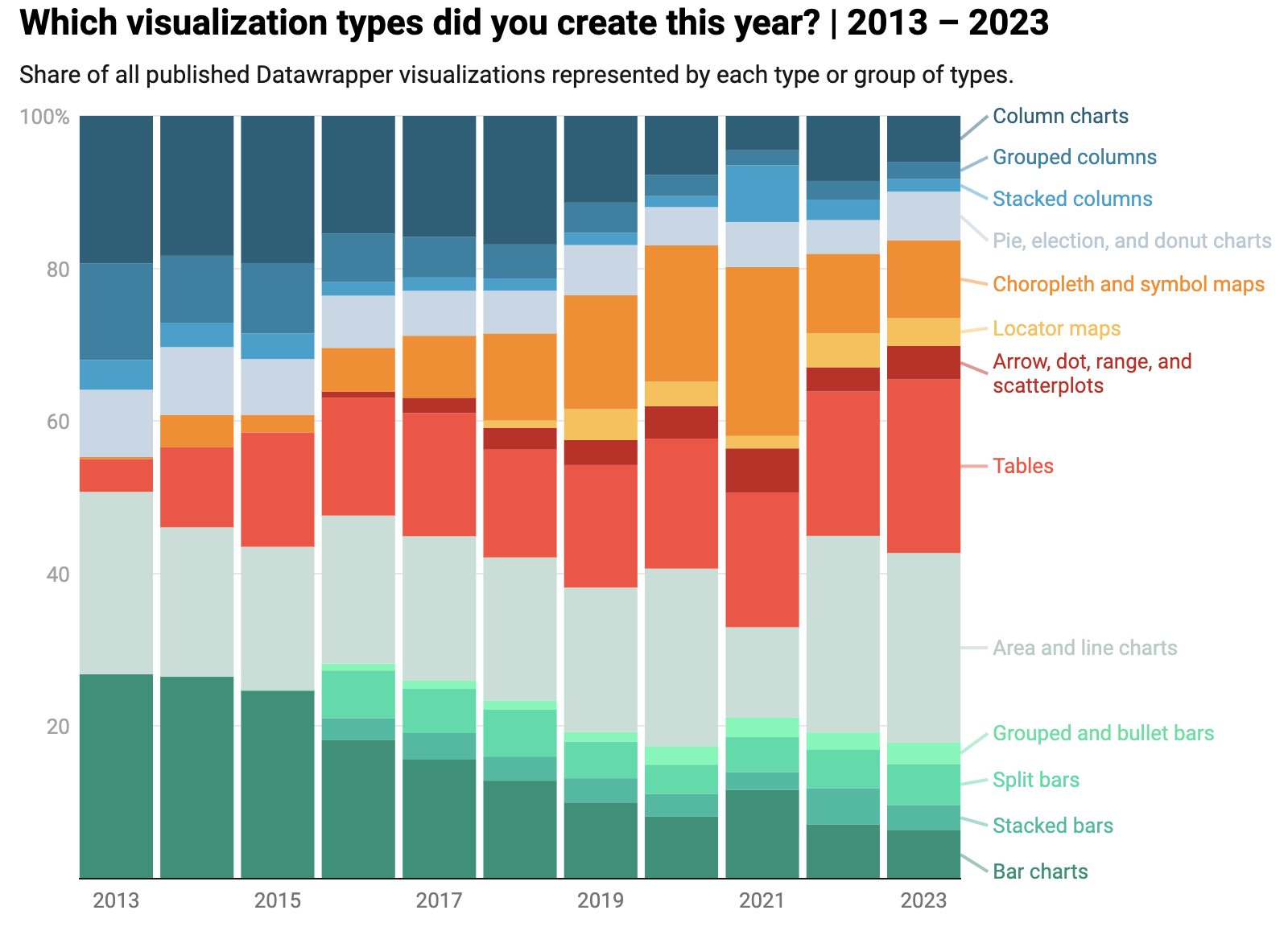
Have you ever asked yourself, “What were the most popular types of charts used last year?” Well, you’re in luck because the team over at Datawrapper put together these charts covering the top chart types their users created. It goes all the way back to 2013, and it's fascinating to see the differences over the years!
Charts of charts about charts….how far can the chart-ception go?!
Data viz can be a helpful tool to share the story behind the data. It lets people understand the subject matter more quickly and see relationships between different research points.
Check out this blog to dig deep into our thoughts on pie charts, and click here to check out the full article from Datawrapper.
Brinkley