
Tableau is one data visualization tool we love to use here at Evolve. With Tableau, your creativity almost has no limits! It can be a great way to show data over time, highlight the correlation between two variables, and make data points look visually appealing. Tableau can also allow the viewer to interact with the data and make selections that dynamically affect the visualization. In this dashboard example below, you can see the different "year" buttons in the top right; you can click on these, and the whole page will update with the relevant information, showing sales data for that year. To see this in action, click here to go to the Sales Dashboard created by Sebastine Amede on Tableau Public. You can also change pages by selecting one of the buttons on the left side of the dashboard: Executive Summary, Product Analysis, and Order Details. On each page, there are more filters that you can adjust to see different information. Take a poke around and see what it’s like! The example shown is for product sales analysis, but you can use Tableau to show any data.
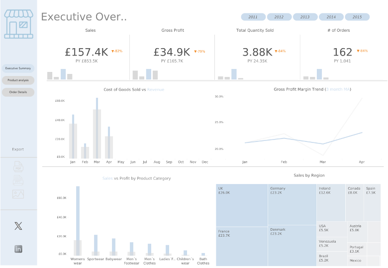
You're not limited to only filtering your dashboard by years; you can set filters for demographics such as age, gender, or household income or even make a filter based on another question in your dataset. You might want to make a filter based on a net-promoter score (NPS) that was established in your survey - you can do that! With features like this, Tableau can be extremely customized to fit your needs and present data in a more compelling way. It's incredible how Tableau can manipulate so much information into a cohesive dashboard page to help your team understand the data.
If you would like to learn more about how we use Tableau and other research tools, reach out now. We’d love to talk!
Brinkley