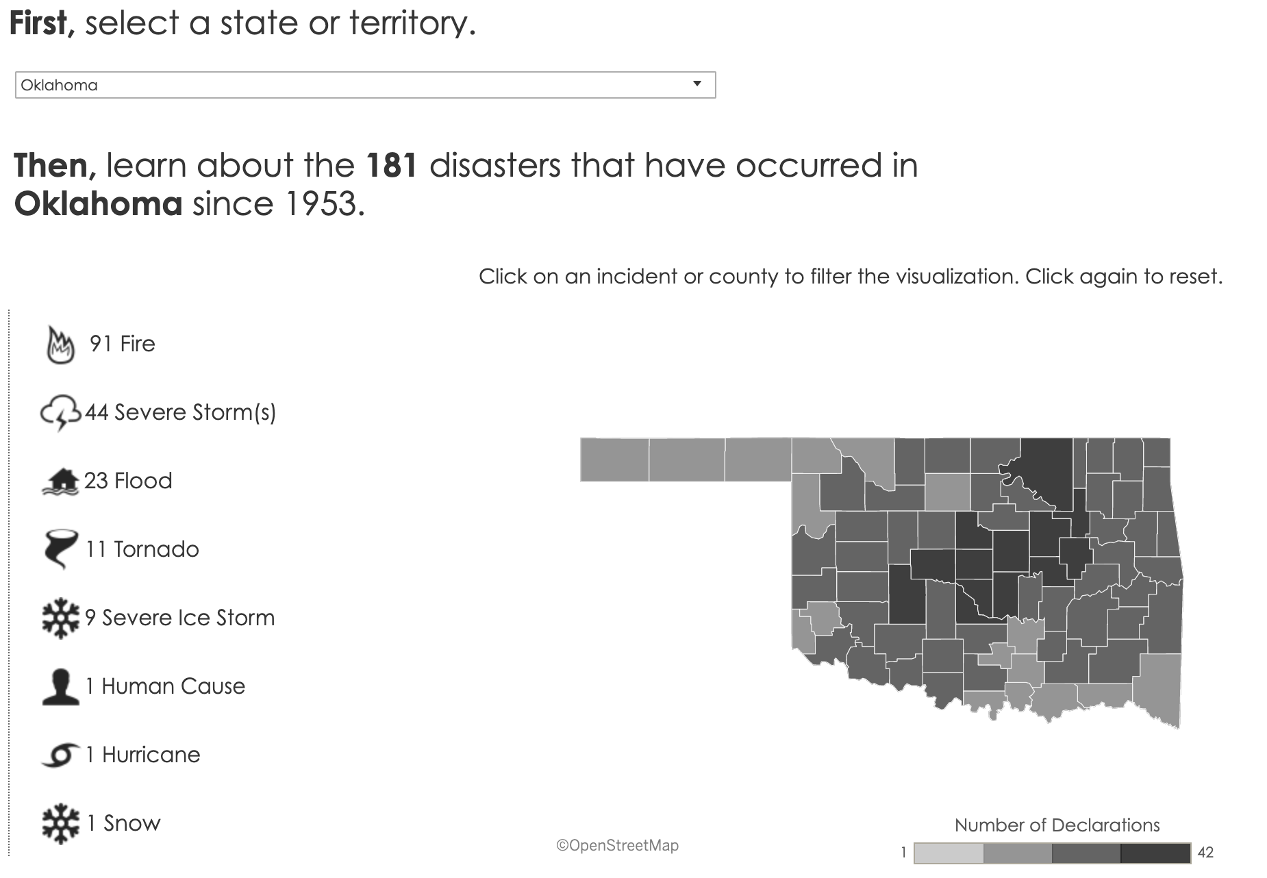
Not all data visualization need color to clearly communicate and this interactive series of charts by the Federal Emergency Management Agency is an excellent example of how a simple monochromatic palette can be used effectively.
The Disaster Declarations for States and Counties map works extremely well - the denser the color, the higher the data point - although the zoom functionality is a bit of a nightmare if you're using a laptop trackpad.
It's great to see FEMA has opted to tabulate some simple data-points, too. Tables are often overlooked in data visualization in favor of some fancy-pants chart. If the table is simple with fewer data-points, it is amazing how much at-a-glance information they can communicate.
Finally, a message for my fellow Oklahomans. Don't get carried away with this lovely spring weather. According to the chart, FEMA mobilized in most Oklahoma counties in 2010 due to a severe ice storm. ;)
Posted by
EvolveKev
Kevin is all about research. Qualitative, quantitative, UX, you name it. When he's not researching, he's to be found laying down beats in his studio and hanging out with his dogs (and girlfriend). Woof.