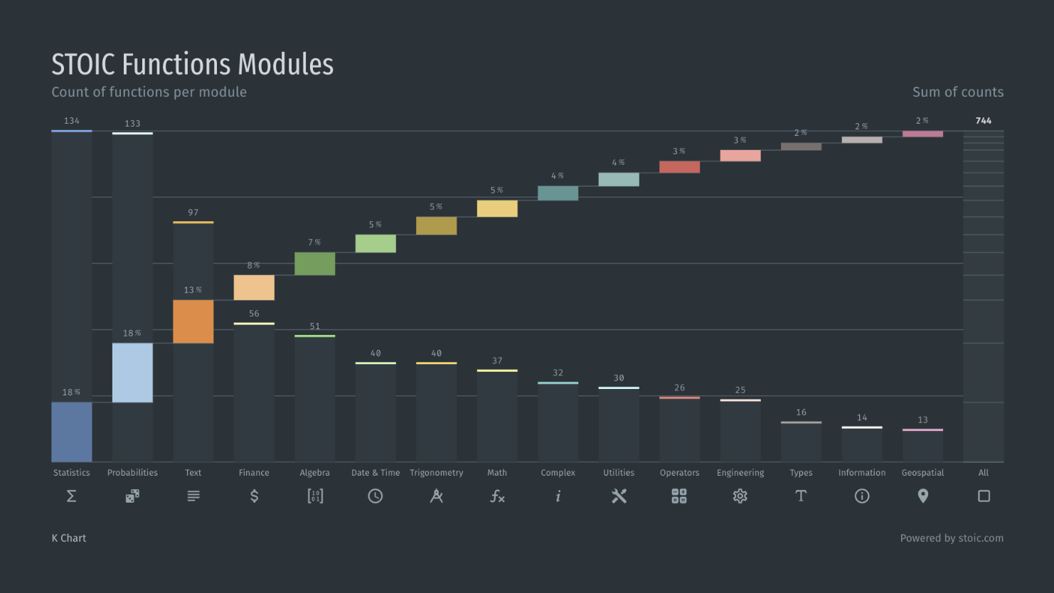
I'm glad I stumbled upon this excellent LinkedIn article this morning and it has inspired me to try a new chart - the K Chart.
The K Chart is an ordered dual-axis chart, which is a fancy way of saying it can show two sets of data simultaneously. The most appropriate use for this type of visualization is to show correlations between two measurements. For example, exploring the relationship between age and the likelihood to agree that addiction is a disease.
While I think the chart is really neat, my only concern is this: will clients be able to wrap their head around it quickly? Through experience, I know the more complex the chart the less powerful the point you're trying to make.
That being said, I'll be testing out the K Chart this week...and I'm legitimately excited about it. What a nerd.
Posted by
EvolveKev
Kevin is all about research. Qualitative, quantitative, UX, you name it. When he's not researching, he's to be found laying down beats in his studio and hanging out with his dogs (and girlfriend). Woof.