
I decided to focus on Fortune 50 companies to keep things relatively simple (and because I had to enter data manually into a spreadsheet!).

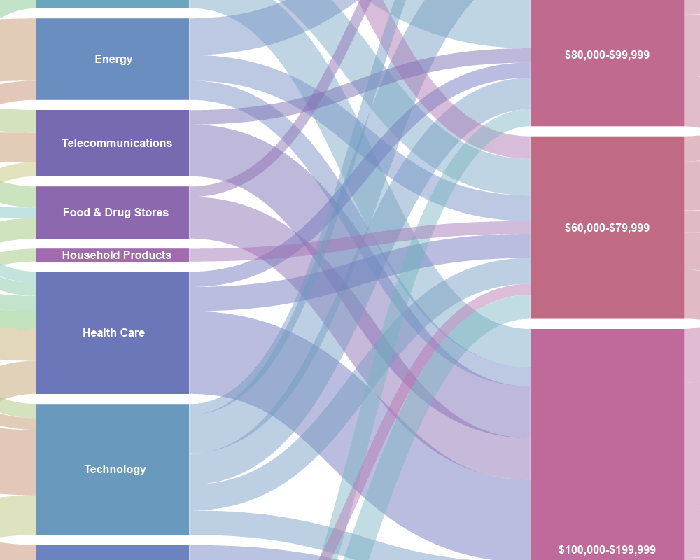
The chart above is an alluvial diagram. It shows the flow and relationships between data. This data visualization examines the state of origin (where the company's HQ is), industry sector, overall 2017 revenues and the total number of employees.
The width of the line is directly proportional to revenue.
What does this chart tell us?
- Fortune 50 companies from California report more revenue in total than any other state.
- Financials is the most substantial grossing sector of the Fortune 50.
- By far, the majority of individual company revenues fall between $100,000-$199,999 million.
- Companies with 250,000 to 499,999 employees are responsible for the majority of the total revenue generated by to top fifty firms.
At this point, I will confess something. There isn't any order to this chart - which is a bit of a no-no in legit data visualization. This chart has been optimized for design purposes, and not practical ones. States, sectors, revenues and employee size are random - I have ordered the data in a way that makes the flow of information look as pretty as possible.
Another thing to note is that each line does not necessarily represent a single company. For example, the thick node connecting California to the technology sector represents the cumulative revenues of Intel, Alphabet, and Apple.
I could add each company to this viz, but it becomes an entirely incomprehensible spaghetti-like mess which communicates nothing.
Regardless, I want you to take a look at that beautiful thickest of the thick lines that branches from Arkansas. Note how that line maintains a uniform height as it flows through sector, revenue and number of employees. If that line were to represent several firms, we would expect the thickness of the lines to vary as it passes from one category to another. Curious.
I wanted to highlight the above curiosity in a more ordered fashion, so I prepared a parallel line visualization:
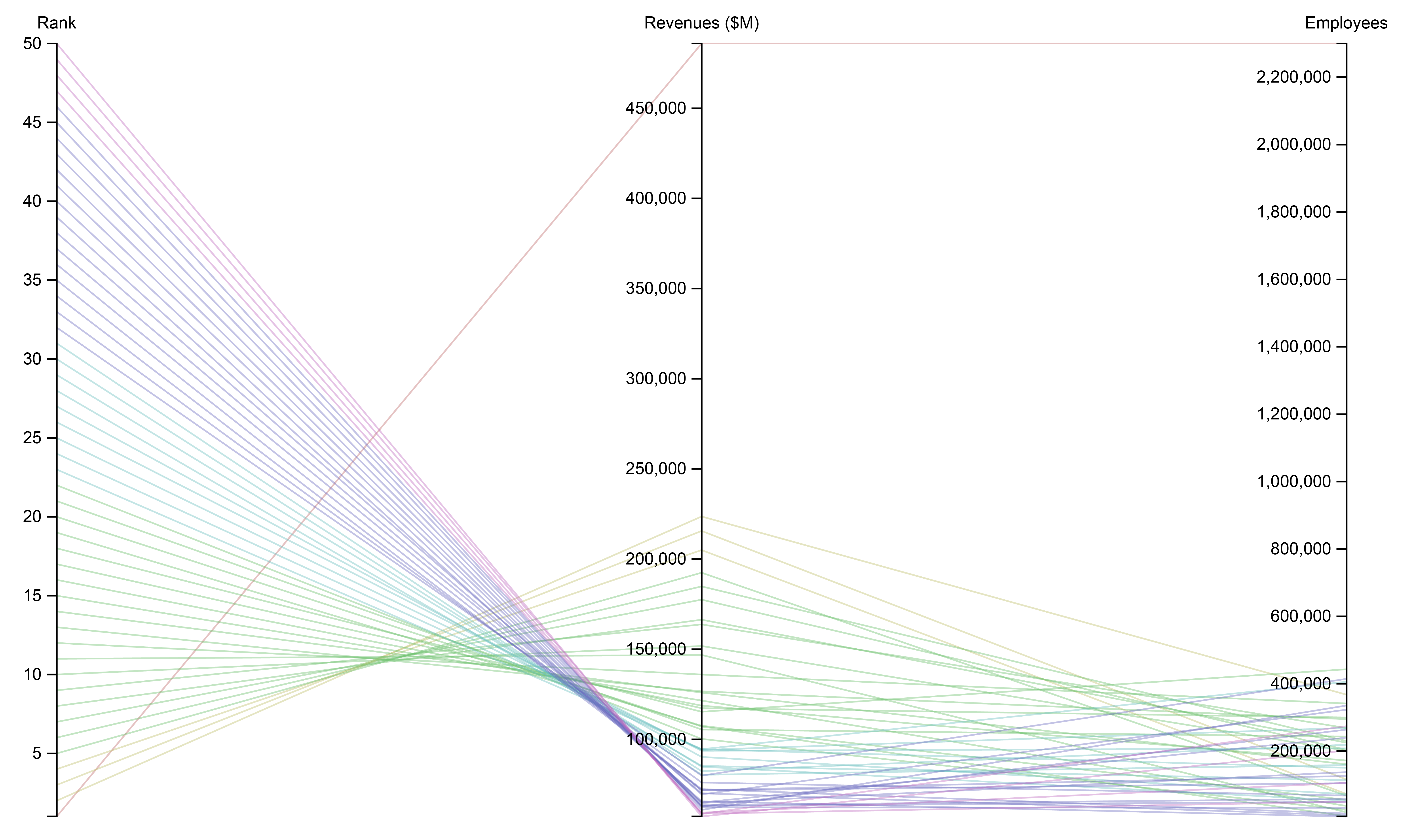
Each one of the lines now represents an individual company. The color dictates overall revenue. The higher the Fortune 50 ranking, the higher the revenue (obviously). The number of employees a company has does not necessarily have a relationship with rank or revenue, as indicated by the bird's nest connecting the latter categories.
What is interesting is that one brown line that stands out. The firm ranked number one absolutely and dramatically eclipses every other firm on the Fortune 50 list in terms of revenues and employees. It's staggering. That's the power of an ordered, proportional visualization right there!
Any ideas which company that is?
EvolveKev

Kevin is all about research. Qualitative, quantitative, UX, you name it. When he's not researching, he's to be found laying down beats in his studio and hanging out with his dogs (and girlfriend). Woof.