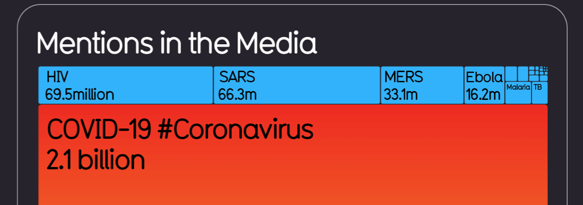
By now, we have all heard the phrase, “flatten the curve.” In fact, as of March 13th, the COVID-19 and #Coronavirus has been mentioned 2.1 billion times in the media, according to Google News hits, surpassing mentions of HIV, SARS, MERS, and Ebola. HIV was at the top of the list, with a whopping 69.5 million mentions in the media. Due to the uncertainty of the timeframe of this pandemic, we know this number will vastly increase, especially across numerous social media and traditional news platforms.
As this pandemic evolves more and more each day, it is essential as a community we are communicating the right messages and not sharing in-correct information. Social media platforms such as Facebook and Instagram are doing their part to monitor the related postings. Several credible resources do their part in making sure they are sharing the most accurate information. I have compiled a list of some top ways to stay up to date through charts and visualizations. You can see information on # of cases, flattening the curve, infection trajectories, risk of contagion, fatality rates, comparisons to other diseases, and more. Many of these sources update every few days, if not daily.
Recommended Resources:
John Hopkins University data dashboard
CDC (COVID-19)
World Health Organization data dashboard
Information is beautiful data pack
Our World in Data
Tableau – COVID-19 Data Hub
Flowing data
Google Trends – Coronavirus
Chart source: Information is Beautiful
Jennifer is all things project management, but she is also passionate about qualitative research, and creating unique graphics and data viz. When she isn't consumed with work, you can find her playing outside with her husband, son and their two blue heelers, starting her next DIY project, or volunteering in the community.