
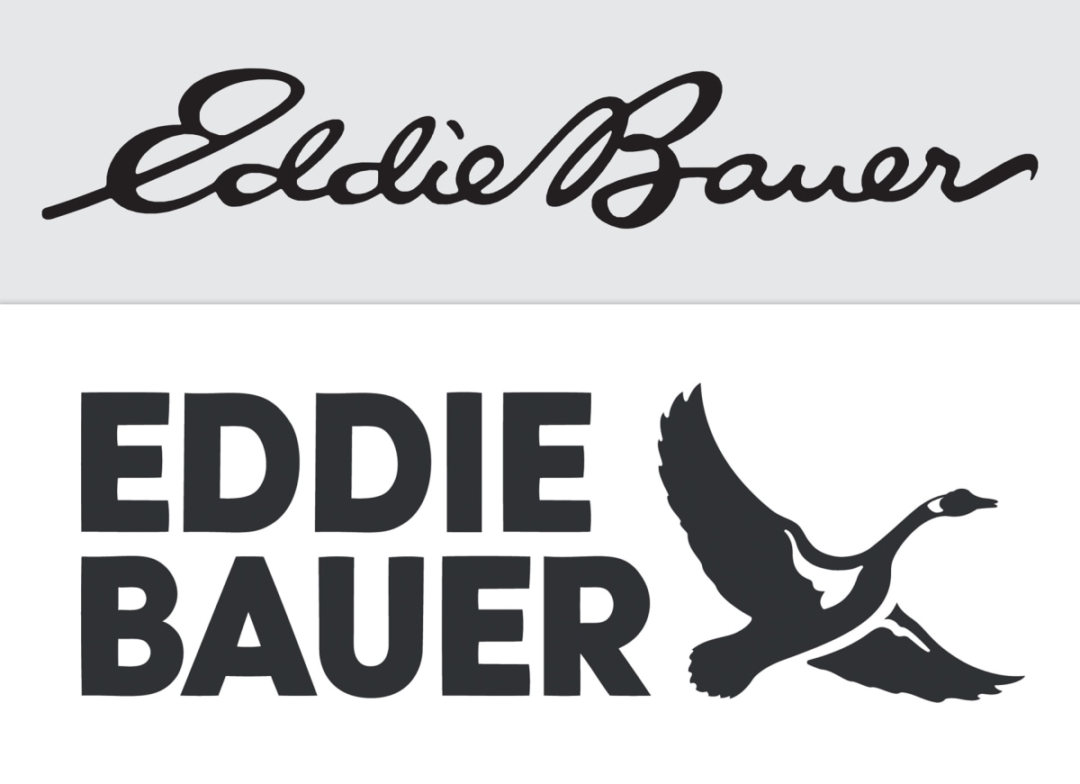
Eddie Bauer is another in the latest round of companies trying to keep up with the trend towards minimalist re-design. Their cursive logo had been around for nearly 60 years, but now, the flowy, cursive script has been replaced with a straight, blocky font accompanied by a small goose to the side. This is to help position Eddie Bauer with an easily recognizable icon and a more legible font. How can the younger generations, who don’t even learn cursive in school anymore, hope to feel connected to a brand they can’t read?
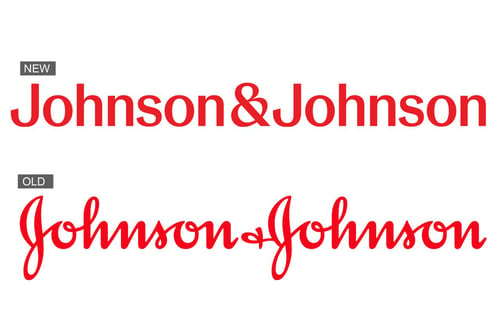
Eddie Bauer isn’t the only company to take their logo in this new direction. Johnson & Johnson recently unveiled their new logo, moving from iconic cursive to thin, sans-serif lettering. Johnson & Johnson’s cursive logo had been in use since 1887. In the image below, see more of these similar rebrands, taking a styled font and changing it to a more traditional typeface.
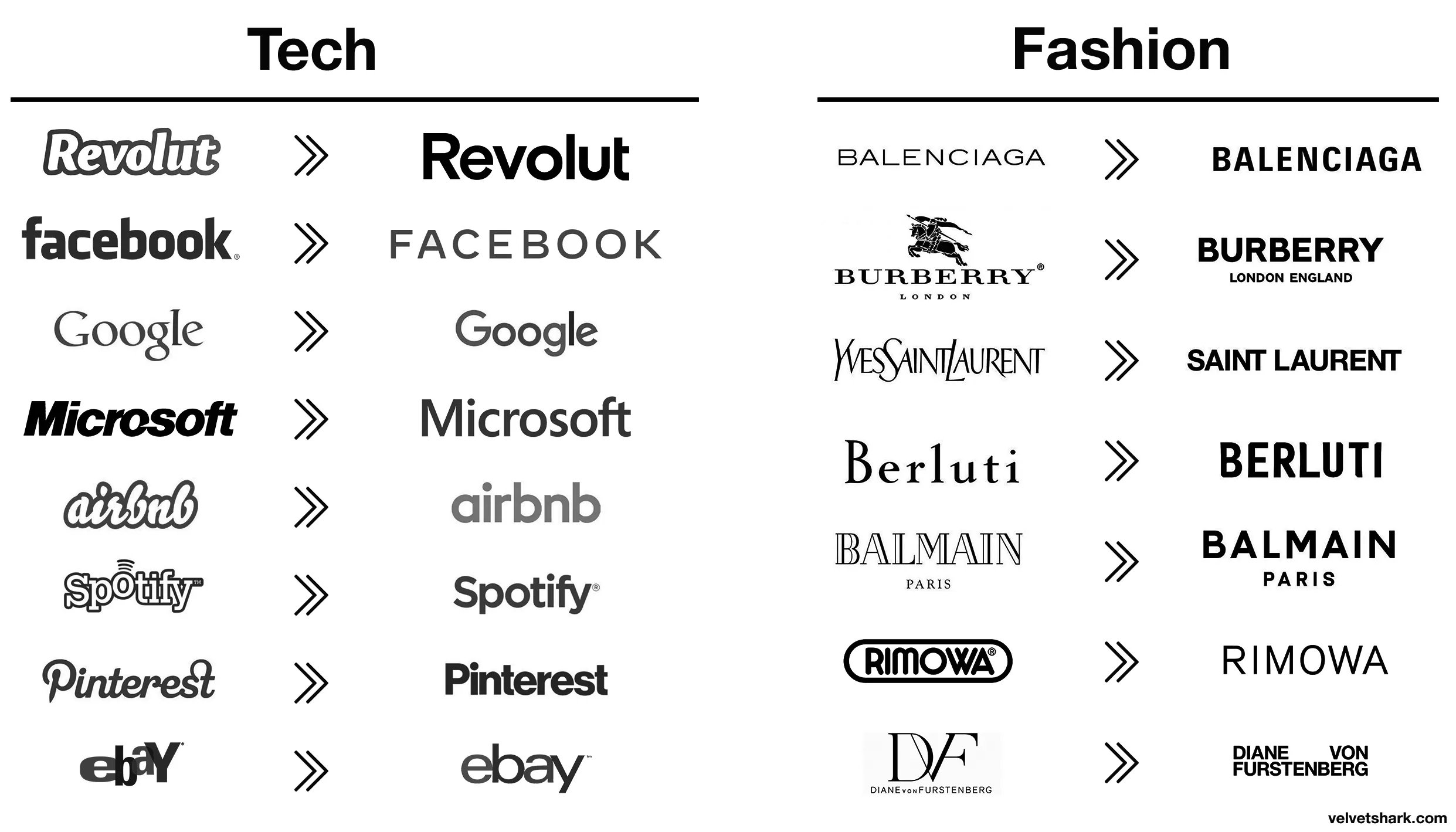
Many people balk at the supposed “lack of character” that comes with these simplified rebrands, claiming that every brand will start to look the same and not be able to stand out from one another. But if cursive is being left out of education, shouldn’t you position your brand to be more accessible and approachable for new consumers? Or should you try to stand out, even with the fear that maybe Gen Z can’t read it?
If you have questions about your target audience and want to better understand more about their preferences and habits, please reach out to us; we’d love to help you!
Brinkley