
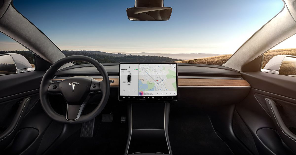
Take a look at the above picture of the dashboard of Tesla's new Model 3. What's the first thing that stands out to you?
If you're thinking, "hey, this dash is ser
iously sparse," then you and I are thinking the same thing. In fact, unlike the Model X, S and seriously gorgeous Roadster, the 3 doesn't even feature the speedometer and fuel gauges in the traditional location.
Regarding how we traditionally drive cars, this is a big step. It's a radical change from how we, as car users, interact with a vehicle. The speedometer and fuel gauges present vital data points during our daily commute, so why has Tesla moved them?
Elon Musk explains it in two seconds.
"The cars will be increasingly autonomous."
How you and I drive our car is not how we'd drive the Model 3. We always need to check our speedometers because we don't want to go too fast and break the law (or, ah, get pulled over by the cops). We need to keep an eye on the fuel gauge because we don't want to run out of gas. With a Model 3, we won't have to worry about such things since that responsibility now belongs to the vehicle. Heck, we don't even need to worry about colliding with other automobiles since Tesla's Autopilot takes care of that, too.
Tesla's decision is interesting from a usability perspective. Traditionally, UX practitioners are primarily concerned with how systems meet the current expectations of the user. I'm in my car, and I need to check my speed; therefore that information needs to be right in front of me at all times. Tesla is thinking ahead. What if you no longer need to check your speed? What if miles per hour is no longer an essential data point?
Tesla is designing the user experience around how we will think, not how we currently do so. That's a truly visionary concept.
Tesla isn't the first company to evolve how we think and design experiences accordingly. On January 19, 1983, Apple launched the Lisa - a ten thousand dollar desktop computer. While the Lisa pretty much flopped, it did bring graphical interfaces and the mouse to the mainstream (and the masses).
What I love about the Lisa is the fact that Apple had to "force" users to think differently about computer interfaces. Take a look at the picture below - what's the Lisa missing?

Did you notice the keyboard of the Lisa has no cursor keys? They're not even hidden away as alternative functions of other keys. Apple decided to remove that functionality completely.
In the early days of computers, including years after the revolutionary Lisa launched, computer users would primarily navigate the interface using the cursor keys. Apple found that even on a graphical interface, users would forgo the mouse and revert to what they knew - the cursor keys. To a company like Apple, where experience is arguably everything, users would be limiting themselves unless they were forced to behave differently, so they took the cursor keys away!
User testing is key to a well-designed experience, but sometimes innovation isn't born from expectation. If you want to test your innovations against expectations to achieve the perfect user experience, then Evolve Research has you covered - we specialize in UX research! Reach out - we're here to help!
Related Articles
EvolveKev

Kevin is all about research. Qualitative, quantitative, UX, you name it. When he's not researching, he's to be found laying down beats in his studio and hanging out with his dogs (and girlfriend). Woof.